
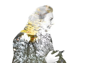
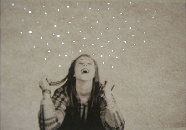
This is my first attempt at overlaying images without a background. Personally, I like this image because I like the greens and browns which cover the models hair because it links the nature aspect of my idea to the person which shows the models personality. I believe this composition is successful because it is not too overexposed and it is focused on all of the model rather than aspects of the image appearing blurry. The sense of mood in this photograph is positive and seems bright due to the brightly edited greenery which is overlaying the model who is laughing and smiling. In both of these image, natural lighting was used which meant I could not control the brightness of the image, even though these two original images were not too overexposed, I edited them both on Photoshop to increase the brightness which made the colours bolder.

Although this is not one of my strongest portrait images, I have still used it the best which I could. I have edited the background to make it white and used bold pink flowers to overlay the models face. The expression which the model has seems like she is concentrating on herself rather than everything around her. The model is trying not to stand out and she is trying to blend in with her surroundings. I like this composition due to the fact that the flowers in the edit seem to fade once they reach the models face, this indicates that the model could be insecure and is trying to direct attention to other things rather than herself; she is trying to hide her personality from others. I believe that this image could be successful if I used a stronger portrait and had better lighting when taking the image. Due to me taking this portrait outside, natural lighting was used which resulted in the image being too underexposed. If I were to reshoot this image, I would take it in to photography studio with artificial lighting and also think about what the model is wearing and maybe change hairstyles and makeup to match my initial ideas.
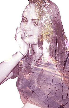
Before I edited this image, it was undrexposed and dull; when editing, I enhanced the brightness and contrast to create a more lively effect. I tried to create this effect because the models personality is lively and exuberant. The main focus in this image is the models face, she is smiling and laughing which indicates that she is enlightening the full image. In my opinion, the edited image is successful, I aimed to create a bright image to enhance the models positive aspects. If I were to reshoot this photograph, I would change the angle in which the model is stood to enable a better view of the main focus, which is her face and smile. Finally, the further ideas that the images have given me is to capture more portraits in outside areas with trees and sunlight as it creates a great effect if the photo is needed to be bright and bold. To create this double exposure portrait, I photographed the model then also captured an image of the reflection of a tree in a stream. Then I erased the background of the portrait and edited it to be black and white. Once I had done this, I edited the second image and overlaid it onto the portrait. I like this specific image because it shows the models bold personality and also livens up the image on a whole due to the aspect of nature. This also shows that beneath the surface of the model, there is different aspects of her personality which are not always shown because she is hiding them.


In these particular images, I have experimented mainly with green colours such as leaves and trees rather than bright flowers or water reflections. I specifically like these edits because they show a range of different textures which creates depth and detail within the images. These compositions which I am creating using Photoshop are unusual in the way they look, they are surreal, however when looking in closer detail, personalities and meaningfulness are seen. The point of focus in these three images is either the models face or her hair, this indicates that the models face is what’s hiding their secrets. My main idea behind these specific images is to portray personalities through the overlaying of nature.


In these two images, I have photographed an amethyst stone to try and achieve different and unusual textures within my image when overlaying. I particularly like this idea because the texture is within the image rather than over the top how it would be with wax of paint. I believe this technique is effective because it creates an unusual look to the image on a whole. I like these two images because the seem to sparkle in an unusual way which I think seems interesting and different; I also like the texture which is given on the image, it does not appear flat which is what I like about the images. As well as this, in these two compositions, I have edited both to achieve different outcomes, I have edited the colours to create one purple and one blue. I like this idea because it shows that people have different personalities to others even though they appear the same. If I were to reshoot these images, I would ensure that my portraits were much stronger than they are. To achieve this I would use artificial lighting in the studio rather than natural lighting. Also, I would get my model to wear different types of clothing to match my idea for the photograph. By doing this, it will make the images more bolder and appealing to look at.
In this particular image, I have experimented to try and make decaying flowers feminine and pretty. I have done this by taking a portrait and editing it to be black and white, once I have done this, I edited the decaying flower to be bright then overlaid this on the image of the model. I believe this image is successful because it achieved the look which I had hoped for and it looks feminine as well as decayed I like this image because it gives the photograph a different texture to my other edits however, the image appear 2D due to not using studio lighting and the way I have edited the photograph.
I found this image on Pinterest which I believe looked interesting and intriguing which is why I attempted to produce something similar. I have taken a portrait and overlaid it with an image I have taken of some trees. Once I had done this and edited the brightness and adjusted colours, I overlaid another image but of cracked paint to create a decaying and cracked effect which I really like. Even though this image is not what I envisioned when creating it, I like the outcome because it is different to my other experiments with my images. One thing which I would change about this composition if I were to redo it would be to adjust the brightness differently because it looks slightly underexposed.


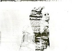
When experimenting and creating this image, I expected a better outcome with the lighting however I did not achieve the effect what I had hoped for. Also, I do not believe that this composition is successful in the way it looks because it appears too yellow in colour and the model is not very clear. When I envisioned this piece, I thought it would be brighter and not a yellow colour, as well as this, I thought that the light would shine through the pin holes better. Ultimately, the image is too underexposed and appears blurry. If I were to reshoot this image, I would use different lighting, possibly natural lighting rather than artificial to shine through the photograph. To create this image, I have printed out an edited portrait and used a pin to create different sized holes in the paper. After this, I used artificial lighting in the darkroom and took a photograph of the original image in front of the lighting. One further idea which I have gotten from creating this piece is to experiment more and try different techniques with different lighting and camera angles.
When creating this composition, I was inspired by Daniele Buetti who uses a pint to make holes in photographs then shines artificial lighting through the image. I do not believe that this experiment was successful due to it not achieving the outcome what I had envisioned. As well as this, the image appears too yellow in colour and the model is not very bold and doesn’t stand out from the plain background of the image. When taking this photograph, I used artificial lighting in the photography studio whilst using a Nikon D3000. After I had taken this image, I printed it out and used different sized pins to create holes in the photograph. Once I had done this, I took my image into the dark room and used artificial lighting to shine through the image. If I were to redo this composition, I would try and use different lighting such as natural to try and receive a better outcome which may possibly give the image a better colour overall rather than it being yellow.
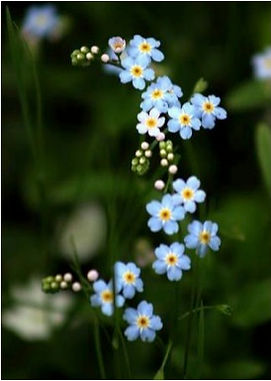
This particular image is one which I have found on Pinterest which I though would be interesting to use to sew onto; this would create the effect which I had envisioned when looking at the work of Jose Romussi. When finding this image, I though it would create the right shape and size of flowers which I needed to overlay onto my portraits. When sewing into this photograph, I chose different colours of thread to use to try and achieve a bolder and more colourful feel to my images when overlaying. Instead of using cotton, I decided to experiment and use thread which is a more thicker material and gives a more fuller effect. My main idea behind this composition was to make my images look more feminine and pretty.

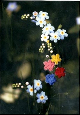
I like this photo because it looks feminine and pretty, I was inspired to experiment and sew my images by Jose Romussi. In this image I have taken a scanned image of sewn flowers which I have created and overlaid them onto a portrait, I did not achieve the outcome which I had hoped for however if I were to sew onto a portrait I believe it would look much better. In this image I was experimenting by linking two techniques together, sewing and overlaying. I also do not believe that this composition is very successful because my idea was to cover the models face with sewn flowers however this was not possible with the two images. If I were to create this composition again, I would sew into the actual portrait rather than overlaying a sewn image onto a portrait because I think it would look better and more successful.


In these images, I have attempted different experimental techniques; I have painted hot wax onto my images to try and create different effects to cover the models face. In the last image, I have painted my photograph with red and green dye then painted the hot wax onto the image which covers the models face even more than normal wax. My main idea behind these experiments was to cover the face which shows that many people hide their personalities and feelings. The main aspect of these compositions which is not very good is that the portrait is not as strong as I would have liked it to be, the focus is good but the model does not seem to stand out from the background and natural lighting was used which makes the image appear too underexposed. I like the way the wax on the images looks 3D and stands out.


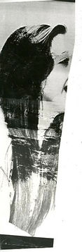
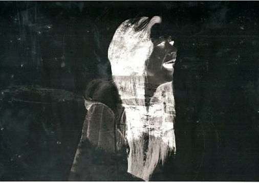
I really like this image which I have created. I have taken a normal portrait and painted over the image using white acrylic paint. I like this because it covers the models face well and I believe it looks quite interesting even though it is just painted. In the second image, I have edited the painted photograph; when editing I have adjusted the colour balance to make it look colder, to do this I have added more blue to the image. By creating this effect, the model seems to stand out more because the background appears darker, even though the model is practically covered by paint, she seems to stand out which is interesting. If I were to create this composition again, I would make my model wear something that would contribute to the image and use makeup to highlight and complement my ideas for the photo shoot.
When experimenting in the dark room, I created a test strip of my chosen image which is printed on acetate to determine whether or not I needed to use magenta and for how long my image needed to be exposed to the light under the digital negative machine. When creating this test strip, I exposed the image under the light for 12, 9 and 6 seconds to determine which length of time would be best to achieve the best outcome for my final composition.

In these images, I have taken a normal overlaid image and created an overlaid negative by using the darkroom. I like some of these images which I have created in the darkroom because they look different to all of my images which I have already created however I don’t think I will be using this technique because I don’t like the way some images look due to not being able to see some of the detail within the prints. I particularly like the image which I have created by spraying chemicals onto the images before developing it using other chemicals. To create the effect on the image. I turned it to the side to let the chemicals run down which creates lines and spots which is darker than the rest, I believe this is an effective and interesting technique to use however I do not like the other images.
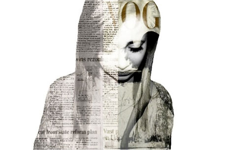
Personally, this is my favourite composition which I have created. To form this image, I have taken a portrait and edited it on Photoshop to be black and white. After this, I have taken a photograph of a newspaper and a fashion magazine then overlaid these images onto the black and white portrait. In this edited image, I believe that the point of focus is on the models left eyelashes; the editing techniques used for this photograph are effective because they enhance the models eyelashes, which is the point of focus, and draw attention to the main idea of peoples personalities. A particular composition by Matt Wisniewski inspired me to create this image by taking two photographs and overlaying them on a portrait; the two images are related but not the same which is effective because it shows that people can have two different sides to their personality. If I were to expand my ideas, I would create a similar composition however overlay a fashion magazine cover as well as some brightly coloured flowers which would possibly make the image appear bolder. I like this piece because it is not brightly coloured or bold however it stands out due to it being different from all of my other work which I have created and also it stands out because it is quite unique and unusual.
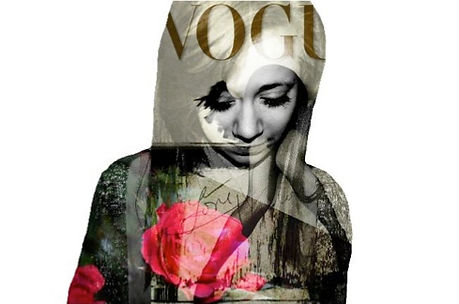
When expanding and continuing with my ideas, I created this composition by using a portrait and converting this to black and white, then using a fashion magazine cover and a brightly coloured rose which stands out in the image. I really like this photograph which I have created through experimenting with different techniques, it looks different and links two different things together in one image. The large pink rose in the image creates a very feminine atmosphere which contrasts with the darkly coloured Vogue magazine cover. I think this photograph looks unique and interesting due to the point of focus being on the models eyelashes; the way the magazine is positioned in the overlay makes the point of focus seem bolder and makes it stand out more due to the dark colour. It makes the point of focus around the models eyes appear to be black and white. If I were to create this image again, I would use a much stronger portrait of my model and when editing the original image on Photoshop I will try to erase the background more neatly to avoid making the model look flat. Although there are negative aspects of the image, I believe its successful because it achieves the idea which I had envisioned, also, it links to my idea of covering people with flowers etc. to hide their personalities.

I don’t particularly like this composition which I have created however it is an aspect of experimentation. My main idea behind this piece was to adapt on my pin hole experiments and try different ways to make an image look interesting using light sources however I do not believe this was a successful experiment. Taking into consideration the depth of field, the main point of focus is the models chin and mouth due to her head facing upwards. In the edited image, not much of the model can be seen due to the lanterns covering her body; only her face is showing properly. If I were to reshoot this photograph, I would use better artificial lighting in the photography studio rather than poor lighting. If I were to redo the edited version of my composition, I would chose a better image to overlay onto my portrait which would then hopefully show the more of the model rather than just her face. Overall, I do not believe this image was successful and I do not believe that it is interesting or different.

When creating this image, I wanted to create a cold and frosty effect which would need experimentation in my actual photo. I have used makeup and different clothing to create this effect which I think is quite interesting and different. I like the way the water covers the models face and how it continues to the background of the photograph. One thing which I think is successful about this image is the clothing which the model is wearing complements my initial ideas for the composition. The overlaid image which is the water appears to be too underexposed which does not make the image successful as it makes the image on a whole look darker. When I envisioned this composition I had hoped for a better outcome however it hasn’t really achieved the effect which I had wanted. If I was going to reshoot this photograph, I would try different angles with the overlaid image to try and make the image lighter due to the lighting being natural.
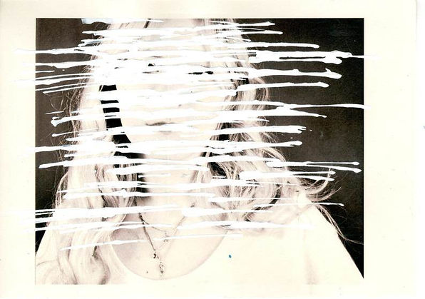
When experimenting with pain on this photograph, I do not believe it is very successful as it did not achieve the outcome which I had envisioned. Also, when trying this technique before it worked a lot bettter. If I were to redo this composition, I would try a different technique with different tools and also try using different colours of paint to try to achieve different and interesting outcomes. If I were to redo this piece, I believe it would benefit my final piece and would add to it to create a diverse range of experimentation on my photographs.
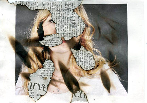
When creating this composition, I glued several pieces of newspaper on top of each other to ensure that there would be different directions of the words. After, I simply burned holes into the image and also burnt the image without creating a hole through it. After doing this, I glued the newspaper onto the back of the photograph to create this effect. I believe this is quite interesting and different as most of the model has been burnt away and replaced by lots of meaningless words going in different directions which looks strange and intriguing at the same time. If I were to redo this image I may not create the burn marks on the photograph and just burn holes through to see what effect that would achieve.


Personally, this is my favourite composition which I have created, although it is very simple. I think it is interesting and looks quite bold and bright due to the single use of one colour when sewing into the photograph. I like this image because although the sewing is not covering the models face, it is covering her eye which is covering everything that the model sees. I believe that this particular piece is very successful and I am happy with the outcome due to it achieving what I had envisioned and hoped for.
I like this particular composition because of the type of experiment which I have attempted. This experimental technique is called marbling. Although this image is presentable, I do not believe that it is successful because it did not achieve the effect which I had hoped for and the nail varnish hasn’t covered the models face properly. If I were to redo this photo I would experiment more before trying the final image and I would also use different colours of nail varnish to see if I could achieve different effects whilst using different techniques and different ways the nail varnish looks.
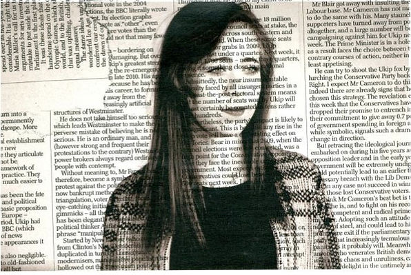
When creating this image, I have glued numerous pieces of newspaper together then copied them onto my original photograph. Although I will not be using this image in my final piece, I think it is an interesting composition and different from other pieces which I have created. When creating this piece, I hoped for the viewer to focus on the models face however the image seems too busy with a lot going on which makes it hard to focus on the models face. If I were to redo this image, I would create it so that the newspaper writing would only be in the background of the photograph rather than being over the models face which would then allow the model to be bolder and stand out more. Also, this would enable the model to be the point of focus in the image rather than the words covering her face.
Personally, I really like this photo because it is quite successful in the way it looks and turned out by using the marbling technique. I think that it is interesting and has achieved the outcome I wanted which was to simply cover the models face. Although the nail varnish is covering her face, the model is still the main point of focus in a strange way. When scanning my experiments onto the computer, the quality of the image decreased and the colour of the nail varnish faded significantly. I believe that this composition is also interesting because even though it is quite busy with the nail varnish, the model is still the main point of focus and her expression still shows through the eperimentation.
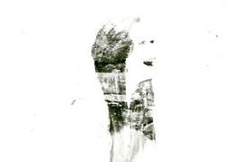
When taking this photograph of my pin hole experimentation, I used artificial lighting in the studio to shine through the image. When doing this, the camera was focused on the light behind the image and not on the image itself which enabled the light shining through the photo to look a lot better however the rest of the image is out of focus and the model appears blurry. I really like this composition because I think it is different and I like the way the it looks because I think it is very interesting.
I really like this composition however I don’t believe it looks very good because of the way the lighting was in the studio. I believe this image would be more successful if it was less underexposed because it makes the image look too dull. I also like the way the pin holes are on the paper and the way they are set out which I believe is quite effective to look at. If I were to redo this image, I would make sure that the lighting in the studio was better which would enable a better outcome when taking my photograph and also this would make the overall composition more successful.

When using this technique I created a photomontage with clipped shapes and layers. I don’t particularly like this technique because I don’t think that it is interesting or different. Also, I don’t believe that it complements my ideas well which makes these compositions unsuccessful. As well as this, I would not use this when completing my final piece because I don’t particularly like the final outcome. However, the images don’t look very bad in a way that they are unfocused or have bad lighting.
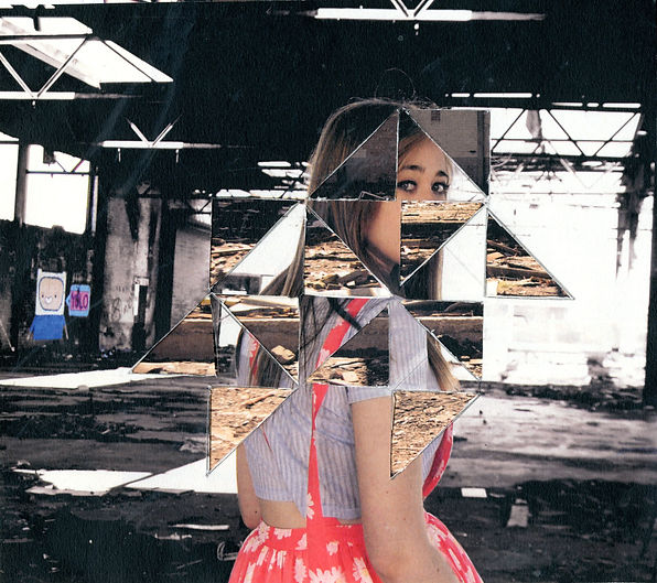
When creating this composition I was inspired by an image on Pinterest and decided to experiment with my own work. I like the way the cutting of the triangles out of the priginal image is not neat becuase this has achieved the effect which I had in mind. I have merged the clipping technique and overlaying together when creating this image as I have used shapes like in the clipping technique then ultimately overlayed an image without overlaying it. I think this is quite an interesting effect becuase it looks different to other techniques such as overlaying which is what I like about it. Also, I have used two images captured at the same place from the same photo shoot when creating this experimentation.